12 Plot FCS-GSEA
GSEA analysis returns a list result, and there are two ways of visualization:
Directly pass the list to
plotGSEA, which enables 5 types (classic pathway plot, volcano plot, multi-pathway plot, ridge plot and two-side bar plot).Extract the analysis result (e.g.
gse_list$gsea_df) then pass it toplotEnrich, which enables 8 more types: geneheat, genechord, wordcloud, upset and network for any gene set, plus gomap, goheat and gotangram for GO gene sets.
12.1 Get GSEA result
For more details, please refer to chapter 9
##       948      1638    158471     10610      6947 100133941
## 5.780170 5.633027 4.683610 3.875120 3.357670 3.32253312.2 Classic Pathway Plot
The running enrichment score of a gene set is drawn as classic pathway plot lines. The function walks down the ranked gene list. The vertical lines in the middle show the location of gene set members.
If users want to show specific pathways or genes, just pass them to the corresponding parameters:
- show_pathway: IDs in the GSEA result
- show_gene: IDs in the GSEA result
pathways <- c("HALLMARK_P53_PATHWAY", "HALLMARK_GLYCOLYSIS", "HALLMARK_DNA_REPAIR")
genes <- c("MET", "TP53", "PMM2")
plotGSEA(gse, plot_type = "classic", show_pathway = pathways, show_gene = genes)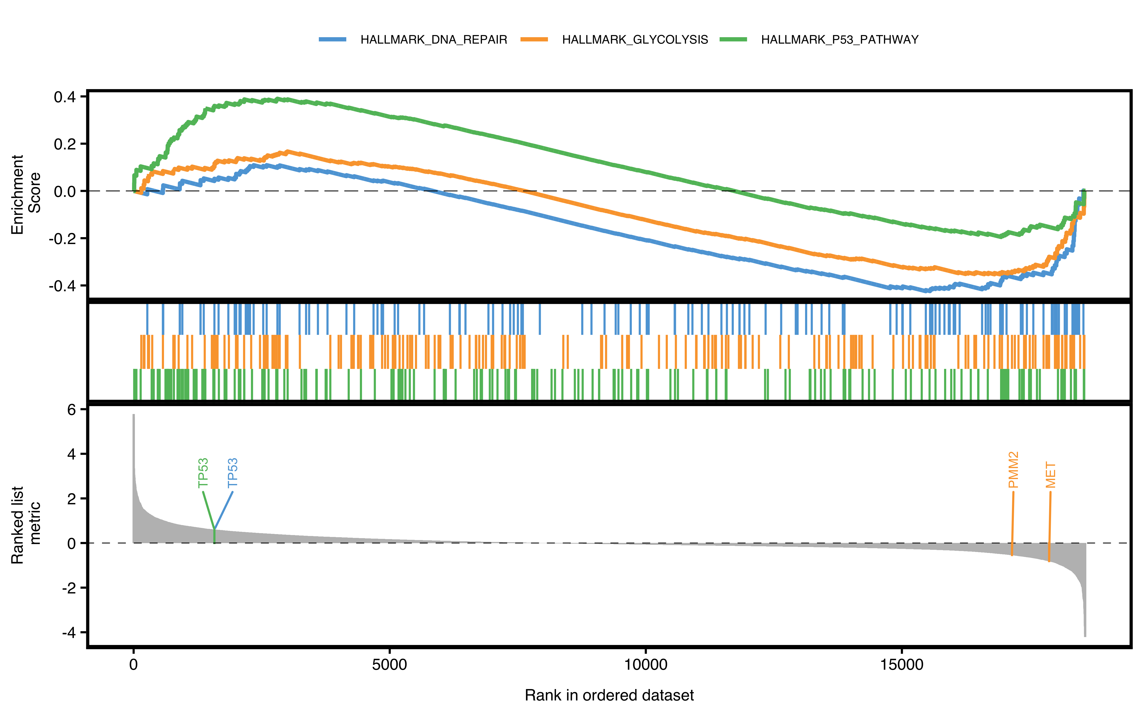
Figure 12.1: Classic pathway plot of GSEA.
12.3 Volcano Pathway Plot
In this plot, the degree of enrichment is indicated by a normalized enrichment score, or NES.
Slightly different from the DEG volcano plot, the x-axis here represents NES, which corrects for enrichment score differences among gene sets.
A significant positive NES value indicates that members of the gene set tend to appear at the top of the ranked data (e.g. fold change of DEG), and a significant negative NES indicates the opposite.
By default, the top N pathways are shown. If users want to show a specific pathway, also pass the argument to show_pathway.
library(patchwork)
pathways <- c("HALLMARK_P53_PATHWAY", "HALLMARK_GLYCOLYSIS", "HALLMARK_DNA_REPAIR")
p1 <- plotGSEA(gse, plot_type = "volcano", show_pathway = 3, remove_legend = T)
p2 <- plotGSEA(gse, plot_type = "volcano", show_pathway = pathways)
p1 + p2 + plot_annotation(tag_levels = "A")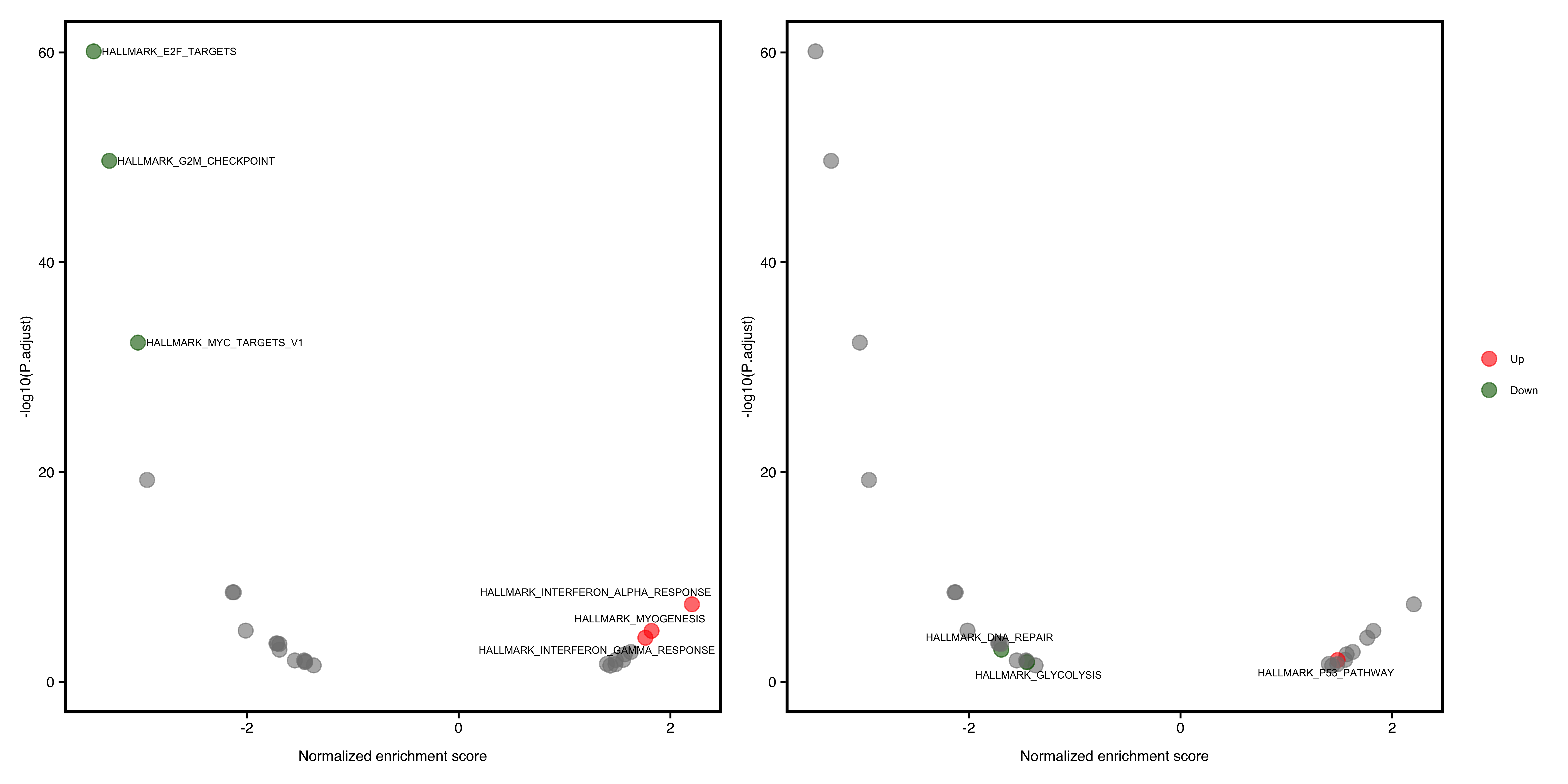
Figure 12.2: Volcano pathway plot of GSEA. default (A), select pathways (B).
12.4 Multi-pathway Plot
If users want to show a bunch of selected pathways, plotGSEA borrows some code from fgsea.
By default, the top N pathways are shown. If users want to show a specific pathway, also pass the argument to show_pathway.
library(patchwork)
pathways <- c("HALLMARK_P53_PATHWAY", "HALLMARK_GLYCOLYSIS", "HALLMARK_DNA_REPAIR")
p1 <- plotGSEA(gse, plot_type = "fgsea", show_pathway = 5)
p2 <- plotGSEA(gse, plot_type = "fgsea", show_pathway = pathways)
p1 + p2 + plot_annotation(tag_levels = "A")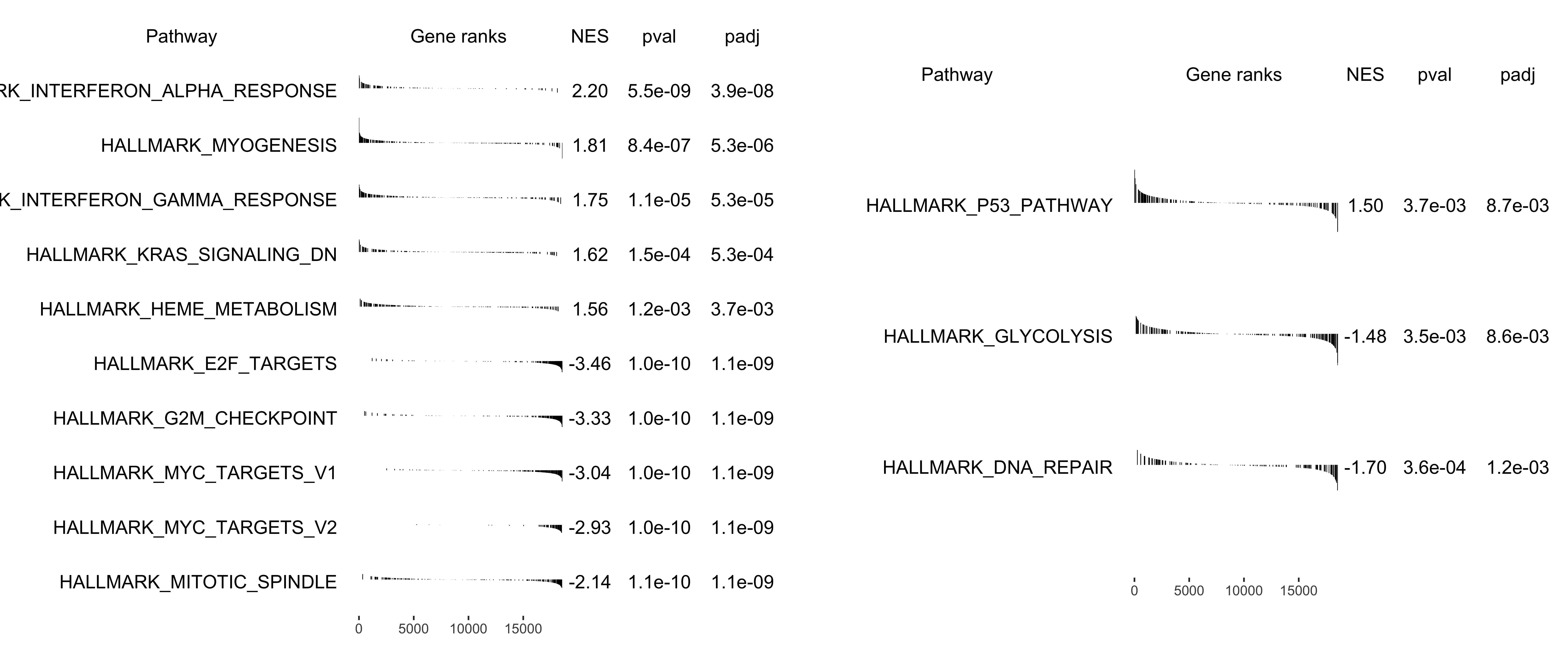
Figure 12.3: Multi-pathway plot of GSEA. default (A), select pathways (B).
12.5 Ridge Plot
The ridge plot visualizes enriched pathways of up/down-regulated genes. The x-axis is fold change and the y-axis is pathways. Color represents the statistical value (e.g. pvalue/p.adjust/qvalue).
plotGSEA(gse,
  plot_type = "ridge",
  show_pathway = 10, stats_metric = "p.adjust"
)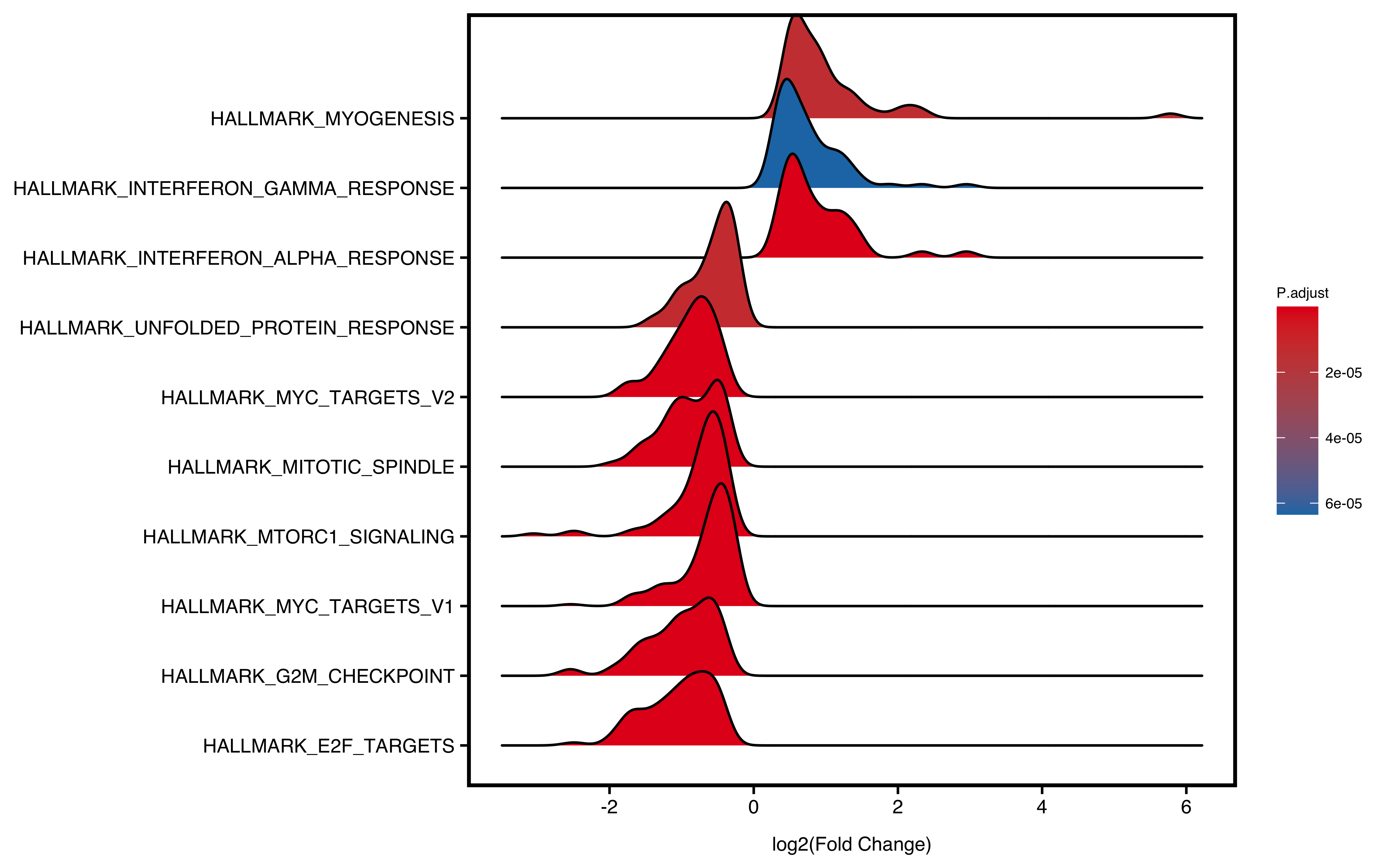
Figure 12.4: Ridge plot of GSEA.
12.6 Two-side Barplot
The barplot separates positive and negative NES into two sides, with zero in the centre and labels on the opposite side of the bars. Users can specify the colour for negative NES, positive NES and non-significant pathways (adjusted P-value > 0.05, grey by default).
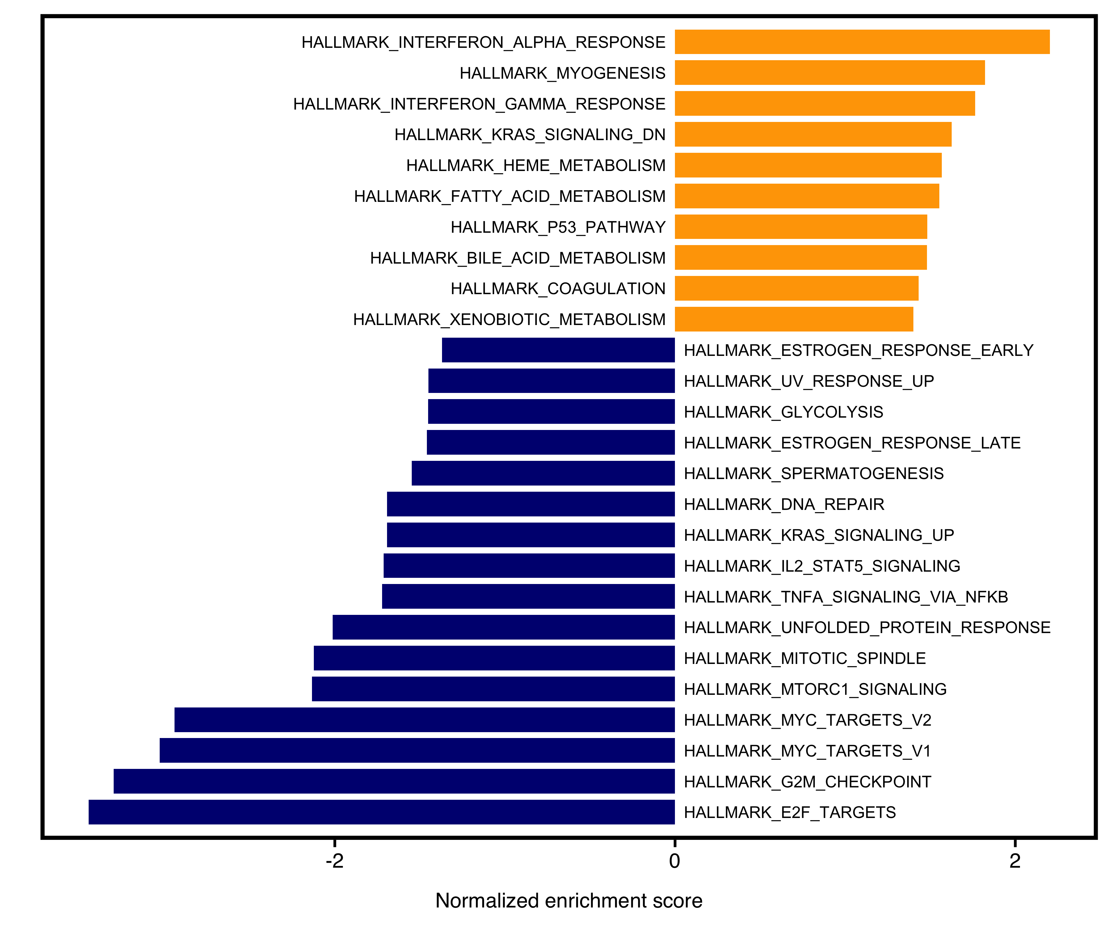
Figure 12.5: Two-side bar plot of GSEA.
12.7 Borrow from plotEnrich
More plotting details are available at chapter 11
Take the geneheat plot as an example. The MSigDB gene set uses Entrez IDs, so genGSEA adds a geneID_symbol column and the plot shows gene symbols:
head(gse$gsea_df$geneID_symbol, 2)## [1] "SMC3/RAD21/RPA1/ILF3/PPP1R8/ZW10/AK2/PDS5B/GSPT1/HNRNPD/SRSF1/MLH1/RFC1/DUT/XPO1/CHEK2/NUDT21/SSRP1/SRSF2/TRA2B/CNOT9/CIT/HMGA1/SMC1A/PA2G4/CDKN3/SYNCRIP/TUBG1/PNN/EIF2S1/CCP110/DNMT1/SNRPB/STAG1/TFRC/LBR/TBRG4/RAD51C/CCNE1/DEK/CSE1L/CCNB2/KPNA2/NUP153/DCTPP1/TK1/DDX39A/CDC20/JPT1/SMC4/LIG1/RAN/PTTG1/NASP/TIMELESS/DLGAP5/PRIM2/PHF5A/CENPM/HMGB2/GINS3/SLBP/EXOSC8/RAD1/POLD1/KIF4A/EZH2/NOLC1/ANP32E/UNG/PAICS/CHEK1/RNASEH2A/BARD1/TOP2A/UBR7/PRPS1/NUP107/KIF22/DCK/CKS2/HMMR/RACGAP1/MSH2/PLK1/POP7/SUV39H1/TACC3/CENPE/BIRC5/NUP205/MTHFD2/AURKA/POLE/RPA2/USP1/PSMC3IP/UBE2S/SPAG5/WEE1/KIF2C/DCLRE1B/DEPDC1/ESPL1/CDCA8/CDCA3/RANBP1/DIAPH3/RFC2/AURKB/MKI67/POLA2/POLD3/MYC/UBE2T/CKS1B/PCNA/KIF18B/SPC24/MYBL2/LMNB1/TMPO/CTPS1/GINS4/BRCA1/MCM3/TIPIN/MELK/MCM2/MCM7/RFC3/TCF19/DSCC1/E2F8/MCM5/MAD2L1/GINS1/MCM4/CDK1/MCM6/ASF1B/TRIP13/HELLS/SPC25/PLK4/MMS22L/LYAR/ORC6/ATAD2/BRCA2/RAD51AP1/RRM2/CDC25A"
## [2] "RAD21/MT2A/SFPQ/HNRNPU/ILF3/CDC27/HIRA/CASP8AP2/HSPA8/RPS6KA5/PDS5B/GSPT1/HNRNPD/MAP3K20/SRSF1/INCENP/CBX1/XPO1/NUP98/SRSF2/TRA2B/TFDP1/HMGA1/SMC1A/CDKN3/BUB3/SYNCRIP/TENT4A/RBM14/LIG3/ODC1/CDC7/PRMT5/MTF2/SRSF10/NSD2/TOP1/STAG1/SMAD3/LBR/SLC38A1/NCL/E2F3/ODF2/CCNB2/KPNA2/SQLE/G3BP1/KPNB1/DDX39A/CDC20/JPT1/SMC4/CENPF/SMC2/KMT5A/PTTG1/NASP/PRIM2/NUSAP1/SLC7A1/DTYMK/KIF4A/FANCC/EZH2/NOLC1/NUP50/CHEK1/TROAP/BARD1/TOP2A/DBF4/NEK2/KIF22/SNRPD1/NDC80/CKS2/TPX2/HMMR/RACGAP1/AMD1/PLK1/SUV39H1/TACC3/KNL1/CENPE/E2F2/BIRC5/AURKA/POLE/CENPA/RPA2/TRAIP/UBE2S/PRC1/KIF11/KIF2C/UBE2C/ESPL1/RBL1/CCNF/AURKB/MKI67/KIF20B/BUB1/POLA2/CCNA2/MYC/EFNA5/DKC1/CKS1B/MYBL2/LMNB1/TMPO/CDC6/MCM3/KIF23/TTK/CHAF1A/UCK2/PBK/E2F1/FBXO5/KIF15/MCM2/STIL/POLQ/MCM5/MAD2L1/CDK1/MCM6/PLK4/ORC6/RAD54L/BRCA2/GINS2/CCND1/CDC45/CDC25A/EXO1"
plotEnrich(gse$gsea_df,
           plot_type = "geneheat",
           show_gene = c("BRCA2", "CDK1", "MCM8", "TIPIN","FBL","ABCC2"),
           fold_change = geneList)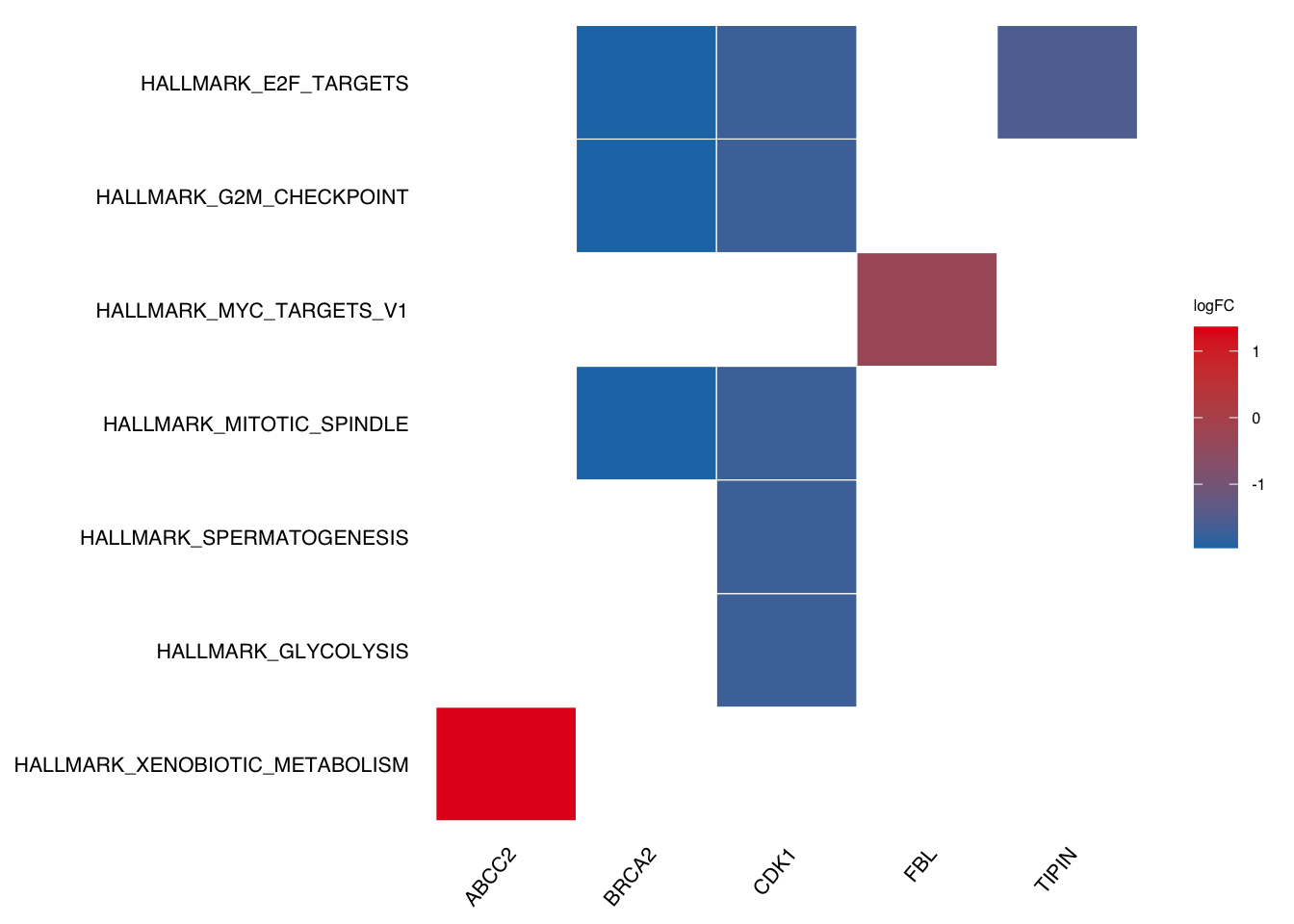
12.8 Tricks
12.8.1 Change figure labels
If we want to DIY labels (e.g. make them lowercase for the plot above), we need to figure out which column the labels come from.
In the above geneheat plot, the labels come from the Description column, so we only need to change that column.
gse2 <- gse
gse2$gsea_df$Description <- tolower(gse2$gsea_df$Description)
# plotEnrich will automatically uppercase the first letter.
plotEnrich(gse2$gsea_df,
           plot_type = "geneheat",
           show_gene = c("BRCA2", "CDK1", "MCM8", "TIPIN","FBL","ABCC2"),
           fold_change = geneList)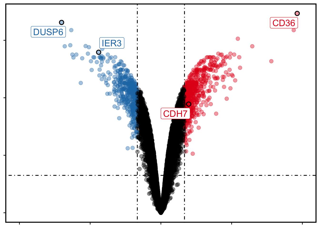
12.8.2 Label pathways by description
plotGSEA labels pathways with the ID column by default. For the volcano, ridge and bar plots, set label_by = "description" to use the Description column instead (edit that column first if you want custom labels):
gse2$gsea_df$Description <- gsub("hallmark_", "", gse2$gsea_df$Description, ignore.case = TRUE)
plotGSEA(gse2, plot_type = "bar", label_by = "description")